Mobile phones have mended their way into our daily life. In this era, our smartphones are no less than Alladin’s lamp. We can perform possibly every task by using our smartphones. In addition to that, it is very handy, and possibly the chances are that you are reading this article using your mobile device only. This is why the popularity of mobile phones has increased tremendously.
With the rise of mobile phones, mobile internet usage has also increased. As of February 2019, 48 per cent of users viewed websites using mobile devices. This number is huge! The business vendors do not want to miss such a large number of audience. That is why they are focusing on making their website responsive. When a website fits itself as per the dimensions and orientation of the user’s device, it is said to be responsive and this ability contains many features. A responsive website will attract more users which will directly bring more revenue to the company.

But it is easier said than done. Designing and developing a responsive website is complex but testing that site is a challenge in itself! There is a wide variety of mobile devices in the market, and when we talk about mobile website testing, it is still in its child’s shoes, and testers face a hard time performing that task.
In this article, we are going to discuss why mobile website testing is so important, and what are the tools and ways that we can use to perform mobile website testing.
Why do we need to perform mobile website testing?
As we have discussed above, mobile website testing is still very new and due to this, the testers face a lot of problems while testing. Now the question here is – “How is mobile testing different and why is it considered to be tough?” The answers are here :
Mobile testing is considered to be tough
Given below are a few points about why mobile testing is considered to be tough and challenging:
- Screen size and resolution
There are thousands of mobile phones available in the market and every fortnight a new smartphone is launched. Every smartphone has a different screen size and resolution. These mobile devices are also different in their hardware configuration which also plays a role in rendering a mobile web application.
- Versions of the Mobile Operating System
The most used mobile operating systems are Android and iOS and their versions are endless. Talking about Android, the latest version is Android 10 but consumers are still using the previous versions as well. There are around 6.06 percent of users who are using the Android version 6 – Marshmallow which was released in the year 2015. Since companies stop rolling down newer versions, people still keep using their devices
- Network
Desktop often enjoys a high-speed internet due to fibre cables giving non-stop internet. So, there is no scope of considering various bandwidths for them. But, mobile users are not so lucky. For instance, if we talk about the network on mobile devices, it can change from wi-fi to 4G/3G and in some parts of the world, 2G. Therefore, network response is a major factor in mobile web testing.
Perks of Mobile Website Testing
- Google prefer Mobile friendly website
On experiencing the enormous rise in mobile usage, Google has changed its search strategy by announcing it’s mobile-first indexing practice. It states that now Google is going to rank and index the websites depending on its mobile version content. This means if your mobile website is par excellence then you can be on the top search results. It will also make your website easy to find.
- Helps in checking the responsiveness of your website
From the above-mentioned point, we all now know why we need a responsive website. Mobile website testing helps you in ensuring that your website is compatible with all mobile devices no matter what OS or browser they are on. It will also improve the look and feel of your website and makes it user-friendly. Users appreciate such sites and revisit those sites regularly.
- Better experience for users
Mobile phones are used on the go. An important factor to consider here is that mobile phones are convenient and speedy. This is why we need a website that matches the same accuracy and speed. The user is our proprietor and we have to keep him happy. By providing the same we directly yield a better experience for the users.
Ways to perform Mobile Website Testing
So far we have learned why it is essential to perform mobile website testing. Now we will learn what are the ways to perform mobile website testing?
- Validate your CSS and HTML Code
The very first thing that we need to perform is validating your CSS and HTML code. Validation is a process of ensuring that things are as per the rules. By validating your CSS and HTML code you can be sure that your website is compatible with all the browsers and is written as per the guidelines and norms of the World Wide Web Consortium (W3C).
There are tools like W3C MobileOK Checker that let you validate your CSS and HTML code. With the help of this tool, you can easily test the compatibility of your website on various mobile devices. It is an automated web-based validation tool. Alternatively, you can use the Google Chrome Developer Tool as well. This tool lets you test your website on different parameters such as screen size, load time, and change in the network. It also lets you fix the minor bugs and errors of your site.
- Manual Testing
One of the most elementary approaches is manual testing. Testing your website on real devices by a human mind is manual testing. Through manual testing, a tester can experience real-time situations that a user will face. The various situations can be the loading speed of the website, the pixel density, network change issue, screen size and resolution change, and much more.
Saying that we cannot deny that manual testing is time-consuming, needs more investment and resources. Also, personally testing the website one by one on all the different screen sizes is a monotonous task.
An alternative to this, you can use the mobile device test suit. The test suite consists of the most popular mobile browsers like Chrome, Firefox, Safari, Opera, and more. It helps you to test your website on different browsers with accuracy and speed and also gives a real-world perspective of the website.
- LT Browser
LT Browser provides you with a platform to test your website on various mobile devices and resolutions. You can perform live website testing across 25 mobile devices that are already mentioned. In any case, your mobile device is not listed, then you can even add a customized device as per your dimensions requirement.
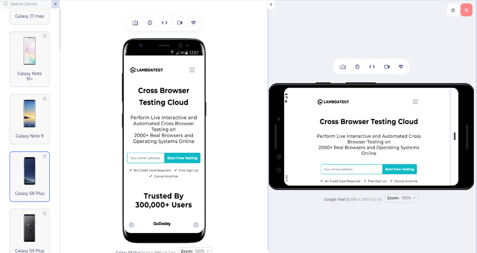
LT Browser allows you to work on two devices or viewports simultaneously as seen in the above image. LT browser is a developer-friendly platform and can be used to perform a fast and reliable responsive testing of your website. You can also test your website’s responsiveness on tablets and desktops using it. There are other features of LT browser as well, that makes it stand out from others. Such as:
- LT browser has an in-built developer tool that helps you in debugging the root cause of the problem quickly.
- The user can check the behavior of their website when the network changes. LT browser comes with an in-built feature that permits the users to test their website when the network changes from low to high profiles.
- You can record your progress report in one single video. This will make your other team members access it more easily.
- With the image editor tool, you can highlight the bugs with a marker (that comes in different colours and shapes), which will make your teammates identify them easily.
- Users can also test their website on offline mode.
- A user can also carry out the mobile website testing of your local website using the LT browser. For that you won’t need any extension or tunnel, just type in your localhost address to check your website over 45+ mobile screens.
- Using LT browser, you can even improve your website’s performance by generating detailed statistical reports of your website. Using those reports you can analyze the weak and strong areas of your website and hence improve its
- With the scroll sync feature, you can test on two devices simultaneously with ease. This feature syncs the scrolling of your both devices.
Apart from responsive testing, if you wish to test whether your website is compatible with all the major browsers or not, then you can go for the LambdaTest website. It is a cloud-based cross-browning web application that lets you test your website on over 2000+ browsers, operating system combinations.
- Use iOS and Android Emulator
An emulator is a computer device that imitates or copy the behaviour of another device. By using iOS and Android Emulators you can execute tests on various sets of mobile phones virtually i.e. without their physical presence. With the presence of emulators, we can check how the website is rendering and being shown on various devices.
You can only test iOS devices using the iOS emulator. iOS emulator is an in-built feature of XCode. XCode is operated only on Mac operating systems. For Android devices, you can go for Android Studio Emulator that creates a virtual environment for testing the website on android devices.
For Windows devices, testers can use the Windows Phone Emulator as well.
Key Takeaways
Here we come to the end of our article. Mobile phones are something we all own now. It is always in our hands or pocket, and we immediately use it whenever any query pops-up in our minds. The statistics show that in the coming future mobile devices are going to take over desktops. This is why it becomes necessary to make your website mobile-friendly. Here are a few concluding lines:
The foremost step you need to perform is to make sure that your CSS and HTML codes are as per the W3C guidelines and are valid.
The tester can choose iOS or Android Emulators to test the website on various Smartphones as it is the easiest method to perform.
Another option for testers is to go for manual testing. It can be used when you have a small set of devices to test on and have plenty of time and resources.
Use LT Browser if your target is testing on a large scale with accuracy. LT browser provides a real-time experience to the users so that they can find any bugs or defects easily.
We hope this article helped you in understanding the different approaches and methods to test your website.